Your Early Paradise Paintings Are Lying to You — Here's How to Catch Them in the Act
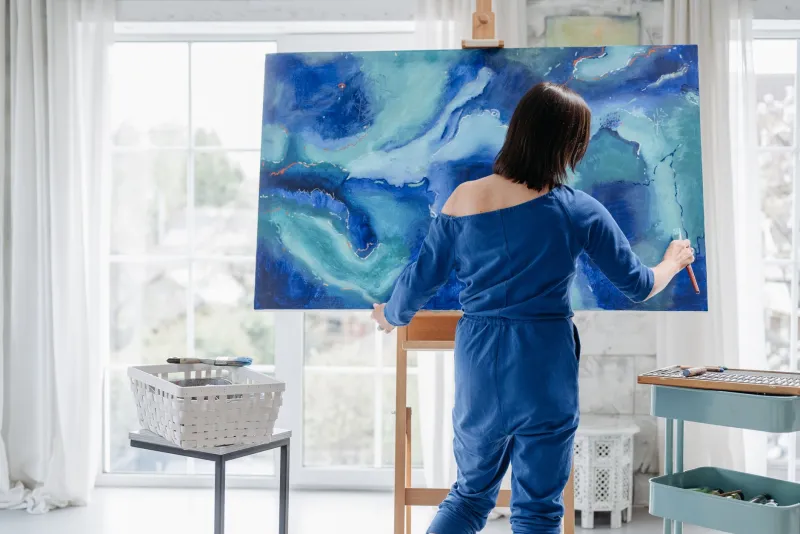
There's a moment that almost every new paradise painter experiences. You finish a tropical beach scene, step back, and feel like something's off — but you can't quite name it. The colors look right. The palm tree is recognizable. The water is definitely blue. And yet the whole thing feels like a screensaver instead of a place you could actually step into.
You're not imagining it. And you're not alone.
After your first year of painting paradise-themed work, certain mistakes tend to show up so consistently they might as well be part of the curriculum. The good news? Once you know what to look for, they're not hard to find — and fixing them doesn't mean starting over from scratch.
The Flat Light Problem (It's More Common Than You Think)
Let's start with the big one: lighting. Tropical environments have some of the most dramatic, directional light on the planet. Whether you're painting a Caribbean noon scene or a golden-hour Maui sunset, that light has a source, a direction, and a temperature — and it affects everything in the frame.
Beginners tend to light their scenes evenly, as if the whole canvas is sitting under a giant softbox. Shadows are minimal. Every surface gets roughly the same level of brightness. The result feels sanitized, like a hotel brochure rather than an actual place.
How to spot it in your work: Print out a small version of your painting and hold it next to a reference photo of a real tropical scene taken at a similar time of day. Look at where the shadows fall on the sand. Are they long and raking (early morning or late afternoon) or short and punchy (midday)? Now look at your painting. Do your shadows agree with the light source you implied?
The fix: Pick one light source before you start any painting and commit to it. Sketch a quick arrow in the corner of your canvas indicating where the sun is. Every shadow, every highlight, every reflected color on the water should answer to that arrow. It sounds simple because it is — but it changes everything.
Perspective That Quietly Breaks the Scene
Beach scenes involve a horizon line, receding water, and often a stretch of sand that moves toward the viewer. That's a lot of perspective happening at once, and it's where a lot of first-year painters quietly lose the plot.
The most common version of this mistake: the waterline sits too high on the canvas and the beach feels like it's tilting toward the viewer at a weird angle — almost like the ocean is about to slide off the edge. Another version is when objects in the distance (boats, figures, distant trees) aren't scaled down enough relative to foreground elements, making the scene feel cramped and airless.
How to spot it in your work: Use a ruler or straight edge and check whether your horizon line is actually horizontal. Then look at any repeated elements — waves, rocks, people on the beach — and ask whether they get smaller and closer together as they approach the horizon. If they don't, your eye isn't being led into the scene the way it should be.
The fix: Before you lay down color, spend five minutes doing a pencil perspective sketch. Establish your horizon line, mark your vanishing point(s), and lightly map out where your major elements will sit. This isn't about being rigid — it's about giving yourself a spatial framework so the painting can breathe correctly.
Tropical Colors That Are Too Saturated to Believe
This one is counterintuitive. Paradise is vibrant. The water really is that turquoise. The sunsets really do go full neon pink. So why do some tropical paintings feel garish while others feel alive?
The answer is contrast and context. When everything is at maximum saturation, nothing pops. The eye has nowhere to rest, and the overall effect becomes visually exhausting rather than inviting. Real tropical scenes have moments of muted color — bleached sand, gray-green shadows under palm fronds, dusty mid-tones in distant hills — that make the bright areas sing by comparison.
How to spot it in your work: Squint at your painting. When you squint, you lose detail and start seeing value and color relationships more clearly. If everything still looks equally loud, you've got a saturation problem. There should be a clear hierarchy: one or two areas of high chroma, surrounded by quieter supporting tones.
The fix: Before mixing your palette, decide what the star color of the painting is. Maybe it's the electric teal of a wave catching sunlight. Everything else on your palette should be mixed to support that color, not compete with it. Try deliberately knocking back your greens and mid-ground sand tones with a touch of their complementary color or a neutral gray. You'll be surprised how much more vibrant your focal point suddenly looks.
The Copy-Paste Sky Syndrome
Here's a mistake that's easy to overlook because skies feel like background. Beginners often paint the same sky in every tropical scene — a gradient from deep blue at the top to lighter blue near the horizon, maybe with a couple of fluffy clouds copy-pasted in. It's technically fine. It's also completely forgettable.
Tropical skies are moody, layered, and specific to time and weather. A pre-storm sky over the Gulf of Mexico looks nothing like a clear winter afternoon in the Florida Keys. Your sky should be doing narrative work, not just filling space above the waterline.
How to spot it in your work: Pull up five of your recent paintings side by side. Look only at the skies. If they all look like variations on the same theme, you're on autopilot.
The fix: Start a dedicated sky study practice. Spend 20 minutes once a week painting just a sky — no beach, no palm trees, no foreground. Grab a reference photo of a real tropical sky and try to capture its specific mood. Over time, you'll build a visual vocabulary of sky types that you can draw from intentionally rather than defaulting to the same formula.
One Exercise That Ties It All Together
Here's something practical you can do this weekend. Pull out one of your paintings from your first six months and give it the following four-point check:
- Light audit: Can you identify a single light source? Do shadows agree with it?
- Perspective check: Is the horizon line level? Do receding elements scale correctly?
- Saturation hierarchy: Is there a clear color star, or is everything competing equally?
- Sky specificity: Does the sky feel like a real place at a real time, or like a placeholder?
For each issue you find, you don't need to repaint the whole canvas. Try making targeted corrections — glazing a shadow darker here, knocking back a mid-ground color there. Think of it less like fixing a mistake and more like tuning an instrument. Small adjustments, big difference in how the whole thing sounds.
The paintings you made in your first year aren't failures. They're a record of where you started. And the fact that you can now see what wasn't working? That's not a setback — that's exactly what progress looks like.